|
|
Synchrony between plants is important as higher synchrony with other plants leads to more potential pollen sources and a greater likelihood of a seed being pollinated and becoming viable. At this point, synchrony is measured by counting the number of nearby flowering echinacea plants, but my malo curve data allows us to measure synchrony using the number of florets open on a given day for the entire population and comparing it to the number of florets for a given plant. As shown by the graph below, measuring synchrony by counting the number of flowering plants can overestimate synchrony later in the season when flowering plants have less open florets. Time to explore these graphs for different populations and look at the potential impacts.

After working on my analysis for a few days I have realized that whether or not the head is unique to an Echinacea plant does not affect the malo curve for the individual head, or in real world terms, it doesn’t affect the flowering schedule of the head. This conclusion brought up two more questions.
The first question I have is what, if anything, explains the variations in the malo curve for the head if its uniqueness to the plant doesn’t. To try to answer this question I will be investigating is including the population of origin for the plant and the year it was planted in the investigation. I hope that this information will shed some light on the variations in the malo curves.
The second questions I have is how do multiple heads on an Echinacea plant interact to form the malo curve of the plant as a whole. The first thing I did was graph all the heads on a common plant on the same graph, which produced a lot of variation.
 Two heads with no overlap.  Two heads with almost complete overlap.  A plant with 6 heads! Now that I’ve visualized the differences in the data, I’m excited by all the variation that I see. My next step is to produce malo curves for the plants as a whole and start an analysis. With two viable paths of investigation, I’m expecting a lot of work in the next few days.
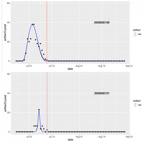
This week I started investigating the Malo curves and visualizing the data. In March of 2014, Lou, one of the citizen scientists that volunteers in the Echinacea Lab, wrote a program to take the daily flowering data collected in 2005 and output the 5 parameters that are needed to draw the Malo curves for individual heads. While these parameters are needed to draw the exponential sine functions, they also act as direct proxies for different phenological features like the start date of flowering, the maximum number of flowers open on a single day and more. So, I have 347 Malo curves drawn for me and lots of data to utilize in my analysis.
This photo shows 2 of the 347 curves that have been drawn. The black dots represent the actual number of flowers open on a given day, while the blue curve was drawn utilizing the parameter’s calculated by Lou’s program. The main focus of my analysis will be investigating how these curves vary, if at all, based on whether or not the head came from an Echinacea plant with other heads or if it was the only head on that plant. So, my first step was to create histograms for each of the 5 variables.
 This is the histogram for one of the parameters that represents the duration of flowering a single head experiences. The red line represents the mean flowering duration, while the blue line represents the median. After my preliminary investigation, it looks like none of the parameters, and therefore the Malo curves, vary based on the number of heads on the original plant. My next step is to utilize statistical tests like Nonmetric Multi-Dimensional Scaling (NMDS) and MANOVA, to determine if and how these parameters are related to each other. Stay tuned!
My name is Rachael Sarette and I am a Junior at Northwestern University studying Mathematics and Environmental Science. I’m originally from Minnesota, so it is exciting to be in the lab hanging out with so many fellow Minnesotans. I’ll be at the lab all day on Tuesdays and Thursdays as part of Chicago Field Studies, which consists of an internship and a class on the Environment, Science, and Sustainability.
 This is me standing by my computer, where most of my work will be occurring. While I have some field experience collecting data for other experiments, this is my first experience working in a lab and analyzing data for my own research project. This quarter I will be using Echinacea data from 2005 and analyzing them with “Malo” curves, which are sine functions that model the number of flowers open on a single head at a given time. The basis of this analysis is this paper written by J.E. Malo: http://onlinelibrary.wiley.com/doi/10.1046/j.1365-2435.2002.00629.x/abstract
I’m excited to see where this data and this quarter will take me. Stay tuned for more updates.
|
|